
The Wise son:
We already explained the importance of accuracy measures in evaluation of a diagnostic test. See here. The key measures we have described were:
Sensitivity - the ability to detect the ill people correctly
Specificity - the ability to detect the healthy people correctly
The problem is that for a given population, not only the two measures depend on each other in a non-parametric fashion, they also depend on the cutoff of our continuous diagnostic measure. To make a point, for a given three different tests evaluated against the same gold-standard reference and on the same population, one could manipulate the tests’ cutoff point to obtain a favorable sensitivity. This is of course, on the cost of lower specificity. To overcome this gap, we borrow here the signal-detection approach which proposes to select the test with the highest Area under the Receiver Operating Curve (AUC of ROC). This Area is obtained by plotting the sensitivity versus 1-specificity for each possible cutpoint of the diagnostic-test. Thus, the ROC provides a measure which is free of the cutoff point.
So, brothers, could you help me introduce the ROC and its advantages?
The Simple son:
From what I know, the ROC curve is displayed in a 2D plane, where the test-results are plotted over all possible sensitivity-specificity points, each falling within the 0-1 range. This 2D plane actually describes the entire give-and-take between the specificity and a sensitivity for each possible cutoff point.
Here is a little diagram I prepared with three tests. You can see that the green test has the best ROC as its AUC is the largest.
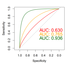
and here is the R code I used in preparing the plot.
library(pROC)
plot.roc(Dat$grp,Dat$PS_1, col="red",print.auc=TRUE, print.auc.y=0.5,smooth=T)
plot.roc(Dat$grp,Dat$PS_2,col="orange", add=TRUE,print.auc=TRUE,print.auc.y=0.45,smooth=T)
plot.roc(Dat$grp,Dat$PS_3,col="darkgreen", add=TRUE,print.auc=TRUE,print.auc.y=0.4,smooth=T)
Just remember, when dealing with ROC, we are no longer using the test unit, and as a rule of thumb i’ll say that:
AUC > 0.9 is very good
AUC > 0.8 is good
AUC < 0.7 is poor
and AUC of 0.5 is like tossing a coin- has no diagnostic value
You can play with it by yourself.
The Wicked son:
OK I played with it, but it started being boring. Maybe a more interesting play will be to test which ROC is statistically the best one. Can you come up with such a test? Once I find the best test I will be able to decide on the best cutoff point too.
And by the way, why the hell is the specificity displayed backward?
The Simple son:
As for your first question, I usually use the DeLong’s test. It is a non-parametric test which requires calculation of empirical AUCs, AUC variances, and AUC covariance.
You can also look for the confidence intervals of the curves and see if they overlap: in our example, the tests PS_1 and PS_2 are overlapped and therefore not statistically different. But PS_3 has no overlap and may be considered statistically significant different from the other two tests.

As for your second question, the x-axis of ROC represents the 1-specificity, which can also be represented as specificity displayed backward. This is the rate of false positives among all cases that should be negative (FP / (FP + TN)). With the x-axis as 1-specificity, as you move along the ROC curve (from bottom-left to top-right), you get more true positives (sensitivity) but this is on the cost of having more false positives (1-specificity). Also, if you plot specificity on the X-axis starting from 0 to 1, you will end up with a left facing curve, and the meaning of the area under the curve will be lost.
And this is the code:
roc.list <- roc(grp ~ PS_1 + PS_2 + PS_3, data = Dat)
ci.list <- lapply(roc.list, ci.se, specificities = seq(0, 1, l = 25))
dat.ci.list <- lapply(ci.list, function(ciobj)
data.frame(x = as.numeric(rownames(ciobj)),
lower = ciobj[, 1],
upper = ciobj[, 3]))library(ggplot2)
p <- ggroc(roc.list) + theme_minimal() + geom_abline(slope=1, intercept = 1, linetype = "dashed", alpha=0.7, color = "grey") + coord_equal()for(i in 1:3) {
p <- p + geom_ribbon(
data = dat.ci.list[[i]],
aes(x = x, ymin = lower, ymax = upper),
fill = i + 1,
alpha = 0.2,
inherit.aes = F)
}
#add p value (Delong):
test_1 <- pROC::roc.test(roc(grp ~ PS_1, data = Dat),
roc(grp ~ PS_2, data = Dat),
method="delong")
test_2 <- pROC::roc.test(roc(grp ~ PS_1, data = Dat),
roc(grp ~ PS_3, data = Dat),
method="delong")
test_3 <- pROC::roc.test(roc(grp ~ PS_2, data = Dat),
roc(grp ~ PS_3, data = Dat),
method="delong")
text_for_roc <- paste0("P values from DeLong's test:",
"\n PS_1 versus PS_2: ", round(test_1$p.value, 3),
"\n PS_1 versus PS_3: <0.001 ", #round(test_2$p.value, 4),
"\n PS_2 versus PS_3: <0.001" #round(test_3$p.value, 4)
)
p + annotate("text", 0.35, 0.25, label =text_for_roc) + theme(legend.title = element_blank())
And by the way, in the first diagram you see the smooth theoretical ROC, but in the second diagram I decided you better see the actual observed ROC which is a unique curve of each different test.
He who couldn’t ask:
Yo, guys! Does anybody know where ROC got its name? It goes back to World War II, when they needed to test the ability of radar operators (receivers) to find out whether a blip on the radar screen represented an object or a non-object, meaning – true positive (TP) or true negative (TN) result.
And even more important - did you know that DeLong is a woman? Elizabeth Ray DeLong! Oh, I’m honored to have you on our blog!