
The Wise son:
I’ve created the best score to classify between two groups. We already talked about ROC and AUC to evaluate a diagnostic tool, but I want an intuitive way to visualize the qualities of my score’s classification. Any suggestions?
The Simple son:
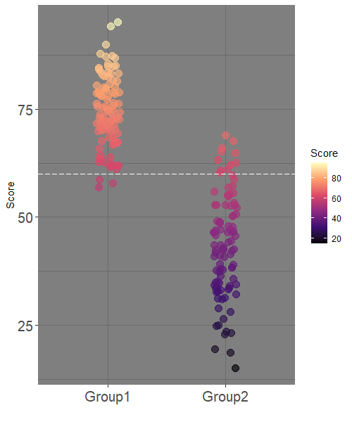
I think I have a great graph exactly for that. Simple, clear and easy to create.
ggplot(df, aes(Group, Score, color = Score)) +
geom_jitter(width = 0.1,
size = 3.5,
alpha = 0.65) +
scale_color_viridis_c(option = "magma") +
ylab("Score") +
xlab("") +
theme_dark() +
theme(axis.text = element_text(size = 15)) +
geom_hline(yintercept = c(60), col="white",linetype=5)
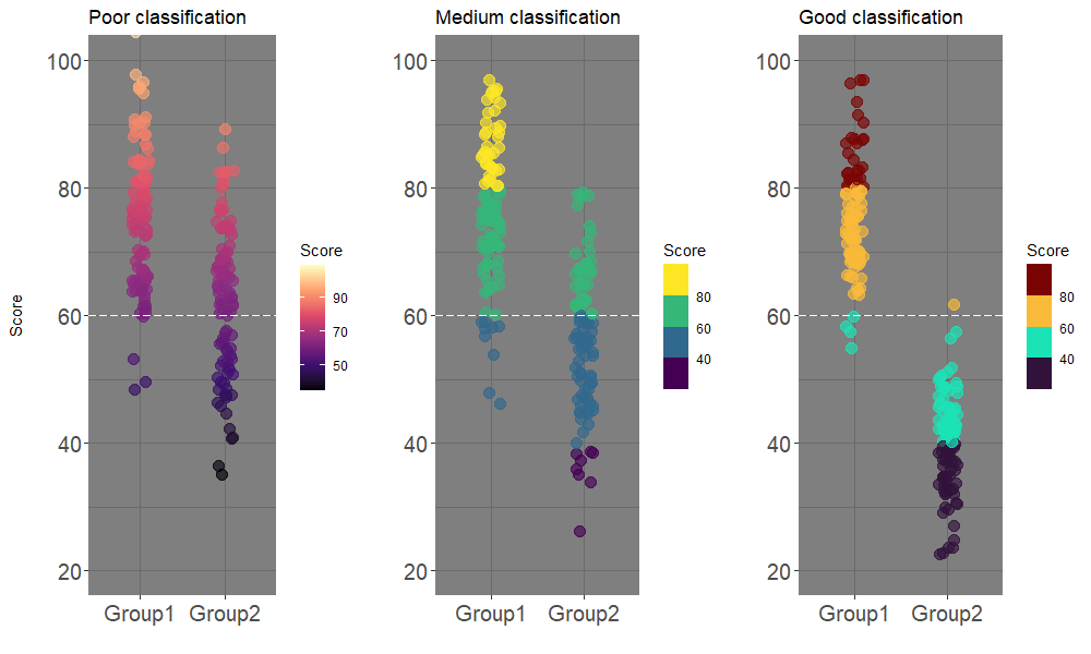
And here we can see poor, medium and good classification:
The Wicked son:
Simple, your colors are very nice, but don’t you think you’ve made it sound too simple this time? It is just a Scatter plot to present the distribution of the score in each class!
The Simple son:
Well, how many times does your audience say “Wow!”? This is what happens with this kind of graph. Moreover, you can clearly see the misclassified (false positives / false negatives) cases: the dots below in group-1 or above in group-2 the horizontal line, which is the cut-off.
He who couldn’t ask:
The title of the post about ROC is “ROC: Beyond Sensitivity and Specificity?”, so isn’t the current post should be called “Beyond ROC”?
And you are all “Beyond me”?